Introduction
Tutorials
Getting familiar with GeoData Manager
Changing how GeoData Manager looks
Scenarios for using GeoData Manager
Data types and nodes
Help with data types and nodes
Getting familiar with GeoData Manager
Changing how GeoData Manager looks
Scenarios for using GeoData Manager
Help with data types and nodes
These examples show how to use Multiple Graph options to set up graphs.
Go to node Chemistry: Fluids by sample set.
Set the detail fields to include only the water geothermometer results: At the bottom of the window, click Order. In Choose from stored field selections, select Water Geothermoters. Click OK.
Select the data set to use, the first result for AT-206, which has six rows in the detail table:

Click the  beside
 Multiple Graph and click Time/Elapsed Time Graph. Multiple Graph opens.
Go to Settings and change it to this:
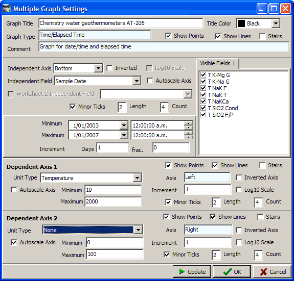
I entered a title. I turned both Autoscale Axis off so I could add some empty space around the series.
The title text looks a bit big, so go to Edit and in the tab Chart: Titles: Text, change the font size to 11 pt.
Go to Schema and change it to this:
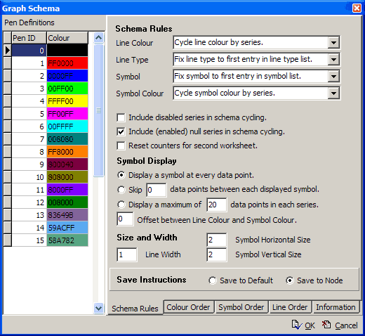
The graph is simple, so the I tried to make it uncluttered. Therefore I chose rules that were fixed or just changed with series.
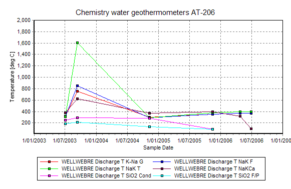
The resulting graph:
The graph initially had a yellow line, which I thought looked too light. I went to Schema and in the tab Colour order changed the Pen ID of line 4 from 4 to 9 (dark brown).
Now look at the graph. The predicted temperature for each date should be the same, so there is obviously something wrong with the measurements in Mid-2003. The SiO2 temperatures are slightly below the others, as expected, because SiO2 precipitates out fairly readily.