Introduction
Tutorials
Getting familiar with GeoData Manager
Changing how GeoData Manager looks
Scenarios for using GeoData Manager
Data types and nodes
Help with data types and nodes
Getting familiar with GeoData Manager
Changing how GeoData Manager looks
Scenarios for using GeoData Manager
Help with data types and nodes
This describes the graph module's menus, its buttons and its windows to configure, customise, import and export graphs.
When a QuickGraph or Graphical Result can be displayed, the Graph menu has options:
These menus are at the top of the Multiple Graph window.
| Menu | Submenu and function |
|---|---|
| File | Print: Open the Print window |
| Return: Exit multiple graph | |
| Edit | Has: Undo, Cut, Copy, Paste |
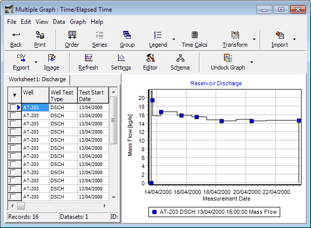
| View | View Worksheet: Hide or show the Worksheet, the data in the data set, displayed on the left of the graph window |
| Highlight Identifiers Sheet 1: Highlight (green) or not the identifiers in Worksheet 1 | |
| Highlight Identifiers Sheet 2: Highlight (green) or not the identifiers in Worksheet 2 | |
| Data | Grouping: Open the Group window |
| Legend: Open the Legend window | |
| Calculations: Open the Time Calcs window | |
| Transform: Open the Transform window | |
| Import: Open the Import window | |
| Export: Open the Export window | |
| New fields: Add a field to the current Worksheet | |
| Delete null fields: Delete fields that have no data in the active Worksheet | |
| Delete Selected Records: Select records (rows in a Worksheet) by clicking the box to the left of the row; this command deletes these selected rows | |
| Empty Active Worksheet: Sets all fields in the active Worksheet to null | |
| Unit Preferences: Opens the Unit Preferences window | |
| Graph | Refresh: Save any changes you have made to graph settings or configuration, recalculate and redraw the graph |
| Settings: Open the Settings window | |
| Editor: Open the Editor window | |
| Schema: Open the Schema window | |
| Set zoom direction | |
| Recalculate only: Save any changes you have made to graph settings or configuration, recalculate but do not redraw the graph |
These buttons are arrayed across the top of the Multiple Graph window.

| Menu | Submenu and function |
|---|---|
| Return | Exit the graph module |
| Print window | |
| Order | Order window |
| Series | Series window |
| Group | Group window |
| Legend | Legend window; the down arrow beside the button has a menu for common changes to the legend |
| Time Calcs | Time Calcs window |
| Transform | Transform window; the down arrow beside the button has a menu for common transforms |
| Import | Import window to import a file of the same format that you imported last; the down arrow beside the button selects a file format to use for the import |
| Export | Export window to export a file of the same format that you exported last; the down arrow beside the button selects a file format to use for the export |
| Image | Image window to export the graph as an image. |
| Refresh | Save any changes you have made to graph settings or configuration and redraw the graph |
| Settings | Settings window to set up the graph axes and series |
| Editor | Editor window to customise the look of the graph |
| Schema | Schema window to customise the look of the graph series colours, point symbols and line types |
The windows, all for Multiple Graph, are:
Print the graph. If you have a second worksheet, both worksheets are printed. To open the window, click Print:
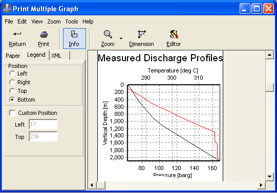
Set up the graph, then click Print. You can also print the graph from the Editor window's Print tab.
Change the order of the fields displayed in a worksheet in multiple graph. To open the window:
If you have a second worksheet, click the tab  of the worksheet to use.
Click Order.
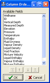
To change the order of the fields in a worksheet, click each field, then click the arrow buttons to move the field up or down the list.
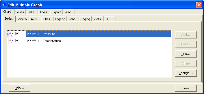
Select series to display on the graph. If you have a second worksheet, you can select series for both worksheets are in the one window. To open the window, click Series.
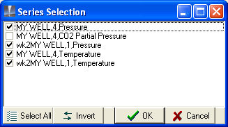
Select or deselect series to display on the graph.
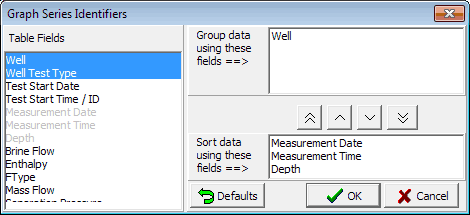
For advanced users: Grouping determines how a graph's series are created from the data in the graph's worksheet. It is rare that you will need to use this group window:
If you have a second worksheet, click the tab of the worksheet to use.
Click Group.
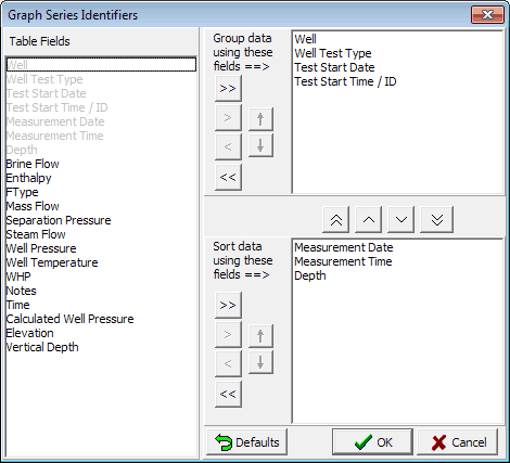
In brief:
Rearrange the fields the same way as you changed column order see here.
The group fields detmine how GeoData Manager creates the different series from the datasets in the multiple graph worksheet. The default is that GeoData Manager creates a series from each dataset you send to multiple graph. That is:
each dataset (line) that you tagged in the header window that you applied to the second worksheet (if any)
and each dataset (line) that you tagged in the header window before you clicked Multiple graph.
This is what you intuitively expect, and this default will be satisfactory for most multiple graphs. However, GeoData Manager gives you options to change the default and to group the data in the worksheets into series in other ways. This is occasionally useful.
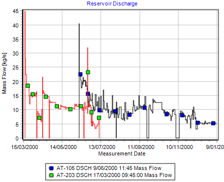
For example: the measurements for one well discharge can be in several datasets, for different ranges of dates. Change the grouping to make clearer graphs:
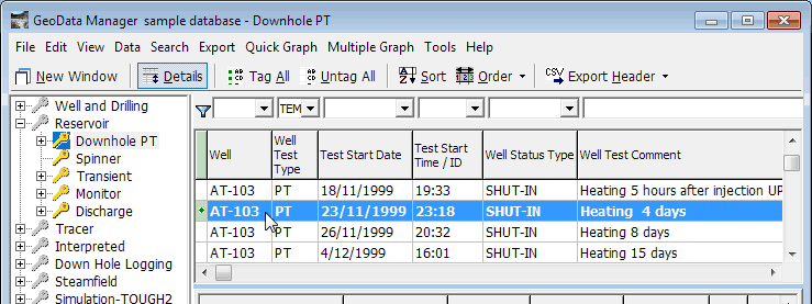
In the sample database, tag these datasets:
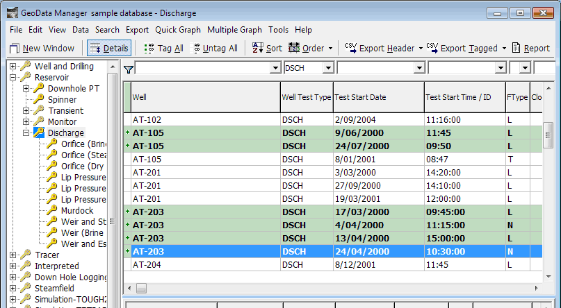
Click Multiple Graph. The series are confusing. Each well has more than one dataset for the same discharge, and GeoData Manager draws them in different colours:
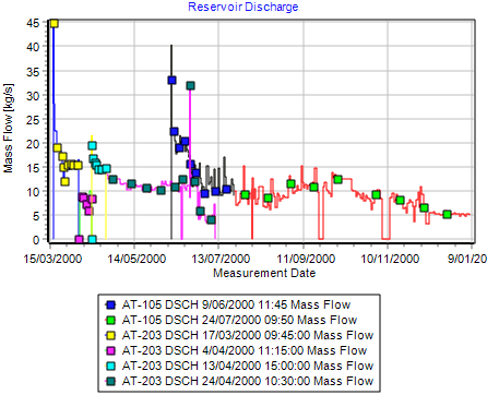
This is the default grouping:
Change the group fields so the series are only grouped by well (it doesn't matter if they are grouped by Well Test Type or not, because all data in the worksheet is for the same Well Test Type):
The graph is now clearer, because all series for a well now have the same colour:
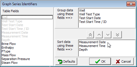
The sort order determines the order in which GeoData Manager draws the segments of a series (a line on a graph).
For example: The default sort order of a downhole PT measurement is 'Measurement date', 'Measurement time' and 'Depth'. That is the order in which the segments of the series are drawn. Say all the measurements are made on the same day. There is a list of measurements, each with a unique measurement time and depth. GeoData Manager sorts the list by measurement time, and for each measurement time there is one depth, so GeoData Manager does not need to further sort by depth. Therefore GeoData Manager draws the segments of the series in order of measurement time.
The default sorting usually gives a good-looking graph, but not always. Usually the instrument is hauled along the well from one end to the other: the measurement date is the same for all measurements and the measurement time and depth change together. In this case the sort order doesn't matter; the graph will be good and will look the same whatever the sort order.
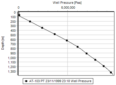
In this example, the operator forgot to increase the date at midnight:
In the sample database, tag this downhole PT:
Click Multiple Graph. The series has an unwanted straight line segment:
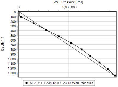
And this is the default sort order:
Change the sort order to sort by depth first:
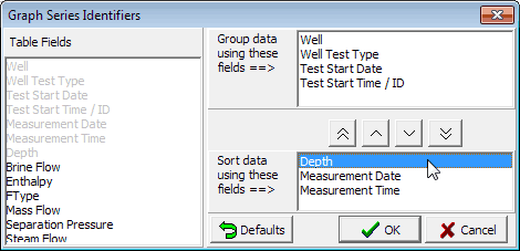
The series now looks good:
Another example where you need to change the sort order is when the instrument first measures from the feedzone to the well bottom, then from the feedzone to the wellhead. Again, changing the sort order to sort by depth first fixes the series.
Set up the contents of the legend. To open the window:
of the worksheet to use.Legend.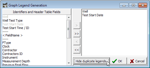
The  beside
 Legend has a menu for common changes to the legend.
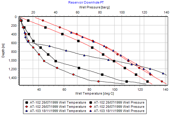
Hiding duplicate legends makes the legend simpler and easier to read if the legend has several series for each item. This example uses PT graphs for three wells: each well has a pressure and a temperature series.
To hide or show duplicate legends:
Either click the beside Legend and choose:
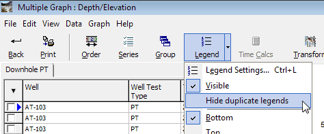
Or click Legend and choose:

Here is an example with duplicate legends shown (you might need to use the Legend window to select the fields to show in the legend):
And here it is with duplicate legends hidden:
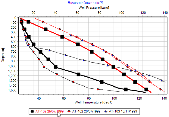
When you hover the mouse over an item in the legend, all series for that item are highlit, as above.
Use Schema to set appropriate rules for the graph. Here:
| Field | Value |
|---|---|
| Line colour | Cycle by field name |
| Symbol | Cycle by data set |
| Symbol colour | Cycle by data set |
For more on using Schema see here.
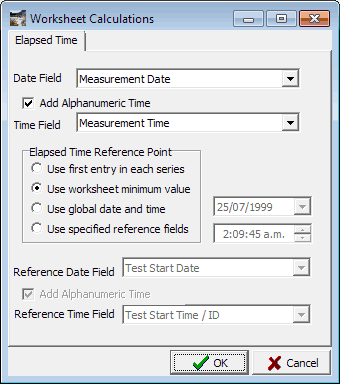
Compare time-dependent series that have different start times. To open the window:
of the worksheet to use.Time Calcs.Read a tutorial on time calcs.
Transform takes one series on a graph, applies a mathematical function to it and displays the result as a series on the graph. A common example is to use a pressure series to calculate saturation temperature.
To open the window:
of the worksheet to use.Transform.The down arrow beside the button has a menu for common transforms.
![]()
Transformer Type and Select Transformer set the type of transform. According to these, other fields will appear in the window for you to enter data. For example if you choose Transformer Type = Arithmetic and Select Transformer = Add then a field appears for you to enter the value to add.
Field is the graph series to be transformed.
Result field specifies if the result of the transform will be written to an existing field in the worksheet or to a new field. If to a new field, you can select a name for the field from a dropdown list. Note that the result of the transform is deleted when you finally exit the MultiGraph window.
Unit Type Subset specifies the unit type of the result of the transform. If the transformation is simple then the graph module will guess the correct unit type, otherwise it calls it Dimensionless. This does not affect the validity of the transformation.
Select a discharge simulation and click Graph to open a MultipleGraph. If necessary, set up the axes to show Pressure and Temperature down the well: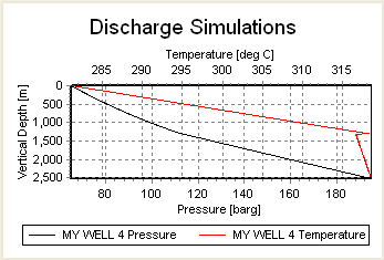
Click the down arrow beside the Transform button and click Saturation Temperature:
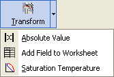
The Transform window has the correct options set up. Select New (by field name) to write the saturation temperature to a new field and select one from the dropdown list - I chose Measured Temperature:
Click ![]() to do the transform, close the Transform window and automatically display the new field with saturation temperature (called Measured Temperature):
to do the transform, close the Transform window and automatically display the new field with saturation temperature (called Measured Temperature):
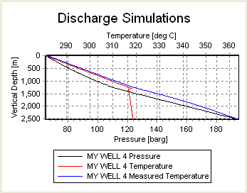
Look at the right end of the worksheet for the new column, Measured Temperature, containing the saturation temperatures. This will be deleted automatically when you exit the MultiGraph window.
Import data to a worksheet where it will be graphed. To open the window:
of the worksheet to import to.Import to import a file of the same format that you imported last. Or click the down arrow beside the button to select a file format to use for the import.First, choose a file name to import:
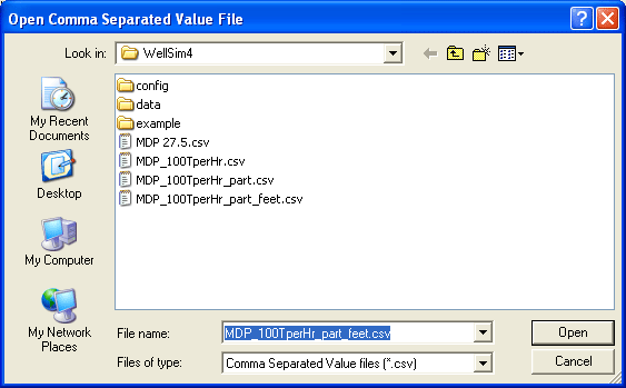
The Import window appears:
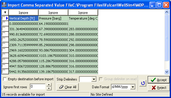
The procedure to import the file is the same as in the import module.
This imports data to a worksheet as numbers, to be graphed. It does not import any graph settings or customisations.
Export data from a worksheet. To open the window:
of the worksheet to export.Export to export a file of the same format that you exported last. Or click the down arrow beside the button to select a file format to use for the export.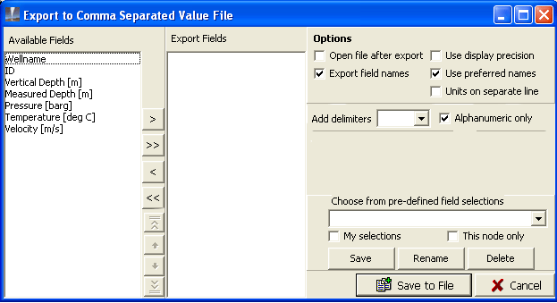
The procedure to export the file is the same as in the export module.
This exports data from a worksheet as numbers. It does not export any graph settings or customisations.
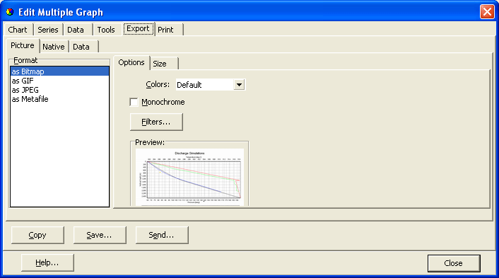
Open the Editor window at the Export tab, to export the graph as an image. If you have a second worksheet, both worksheets are on the image. To open the window, click Image.
Change graph settings, mainly the names and orientations of the axes. If you have a second worksheet, click a tab at the top of the Settings window to select the worksheet to use:
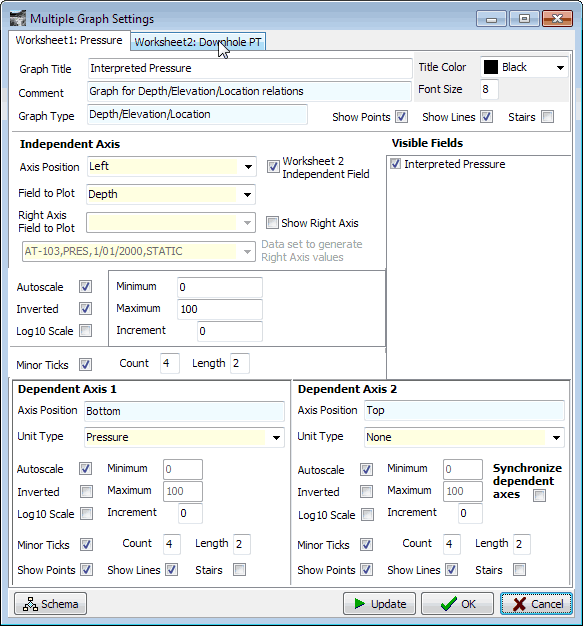
Synchronise dependent axes
If a graph has two dependent axes, then the axis grids can be confusing, see below left. If you tick Synchronise dependent axes then the top/right dependent axis uses the same axis grids as the bottom/left dependent axis. The axis grids are simpler. GeoData Manager changes the top/right axis numbers to suit the new grid.
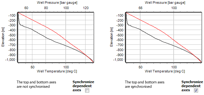
Note: If either dependent axis is logarithmic, synchronization is disabled.
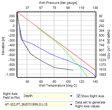
Show right/top axis
If the main dependent axis is at the bottom or on the left of a graph. If this axis has distance down a well (depth, vertical depth or elevation) then you can choose to display a second dependent axis (depth, vertical depth or elevation). And in a multiple graph with more than one well, you can choose which well that GeoData Manager will use to calculate the values for the second axis.
In this example, the main dependent axis is elevation, the second dependent axis is depth and the second axis shows the depths for well AT-102:
Customise the look of the graph. If you have a second worksheet, you can customise both in the one window.
Set the line and point colour, line type and point shape of the different series on a graph. If you have a second worksheet, you can work with both in the one window. For a tutorial on using this window see here.
There are two reasons to use schema:
To help you to read the graph when there are many series, by making series that are similar look similar and making series that are different look different. There are many different types of data that can be graphed, and a schema that suits one kind of data's graph might not look good for another kind of data.
To make the look of graphs meet standards your company might have.
Pen Definitions (left side of the schema window) define the default colours.
Three schema tabs (Colour order, Symbol order and Line order) define the default orders (or sequences) for using colours, symbols and line types.
Then, the Schema Rules tab defines how these default orders and colours are applied to series. Schema can be confusing. We suggest only using the Schema rules tab first until you gain familiarity, then try changing the defaults in the other schema tabs.
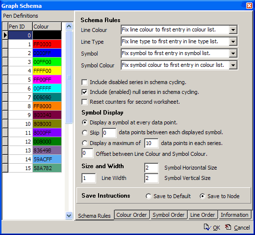
Pen Definitions There are sixteen pens, numbered 0 to 15, each with a colour. To change the colour, double-click the colour and select a new colour. The pen colours are used by the Colour Order tab. It is hard to distinguish line colours on a PC monitor or printout, so don't set colours that are too similar. The default colours will probably do.
Colour Order tab Defines the order for cycling through colours for line colour and symbol colour. To change the order, choose new IDs in the Pen ID column. To make line and symbol colours different, in the Schema Rules tab, set Set Offet between Line Colour and Symbol Colour nonzero.
Symbol Order tab Defines the order for cycling through the built-in point symbols (square, circle, triangle etc). To change the order, choose new symbols in the Symbol column.
Line Order tab Defines the order for cycling through the built-in line styles (solid, dash, dot etc). To change the order, choose new styles in the Line column.
Schema rules tab
Line Colour
Note that this assumes that there are fewer line colours required than there are line colours available in the Colour Order tab. If more are required, schema continues from the top of the list.
| Rule | result |
|---|---|
| Cycle by series | Use a different line colour for each series that is graphed. This rule is not usually as useful as the other rules. |
| Cycle by fieldname | Use a different line colour for each field that is graphed. For example, to make Temperature lines a different colour to Pressure lines. |
| Cycle by dataset | Use a different line colour for each data set that is graphed. For example, to make lines from each well a different colour. |
| Fix to first item in list | Use the same line colour for all series. |
Line Type Has rules, as for Line Colour above, to determine how the line type varies.
Symbol Has rules, as for Line Colour above, to determine how the point symbol varies.
Symbol Colour Has rules, as for Line Colour above, to determine how the symbol colour varies.
Include disabled series in schema cycling
You can disable series (fields) in Series or Settings; when disabled they do not show on the graph.
 When you enable or disable series (fields) the line colour, line type, symbols and symbol colours of the other series don't change (because the rules were applied to include the disabled series (fields)).
 (the normal setting) When you do that, the other series do change.
Include (enabled) null series in schema cycling
Enabled null series (fields) have no data in them, and therefore do not show on the graph.
(the normal setting) Schema applies the rules to determine line colour, line type, symbols and symbol colours including enabled null series.
Schema excludes enabled null series.
Reset counters for second worksheet
The line colour, line type, symbols and symbol colours of the second worksheet start again at the top of the order lists.
(the default) The line colour, line type, symbols and symbol colours of the second worksheet continue down the order lists.
Symbol Display Determines if symbols (points) are displayed, and how many.
Size and Width Sets the line width and the size of the symbols (points).
Save Instructions
Save to default Saves the current schema as the default for all nodes.
Save to node Saves the current schema as the default for this node only.
When you are familiar with how to use the program, set up a schema that is pleasant to you and save it as a program wide default by selecting Save to default. Later as you modify the schema to suit particular nodes, select Save to node.
Note that some schema settings can be modified by other settings in the graph module, for example line colours can be changed in the graph editor.
When the graph is docked, the worksheets and graph are in the same window, side-by-side:
To undock the graph, either click Undock graph at the top, right or click the X close button at the top right of the graph window:
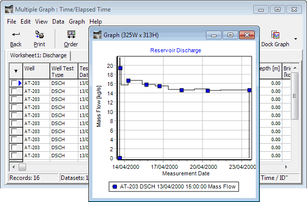
When the graph is undocked, the worksheets and graph are in separate, independent windows. The menus and buttons at the top of the worksheet window work normally. To dock the graph, click Dock graph at the top, right.
Undock a graph when you want to export several graphs the same size. You can set two preset graph sizes, called portrait and landscape, though each can be any size. To use the preset sizes, click the to the right of Dock/undock graph:
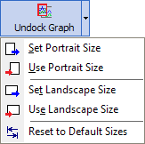
To set a preset size, undock the graph and drag its borders to the width and height you want. You can see the graph's size in the window title. Then click Set Portrait Size or Set Landscape Size.
To set a graph to a preset size, undock it and click Use Portrait Size or Use Landscape Size.