Introduction
Tutorials
Getting familiar with GeoData Manager
Changing how GeoData Manager looks
Scenarios for using GeoData Manager
Data types and nodes
Help with data types and nodes
Getting familiar with GeoData Manager
Changing how GeoData Manager looks
Scenarios for using GeoData Manager
Help with data types and nodes
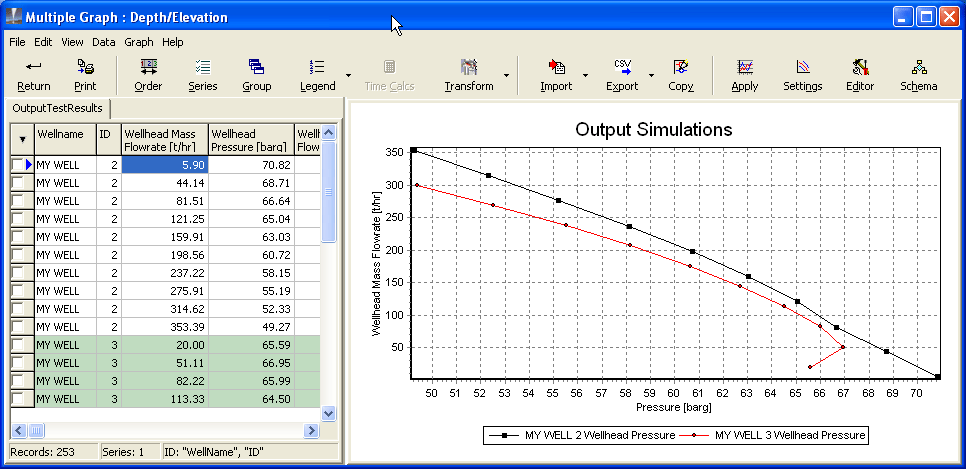
There are graph menus and graph buttons across the top.
The left of the window is the worksheet area, which displays worksheets, which are the numbers in the data set(s) that you selected to graph. In this case:
I selected two output simulations to graph, both for MY WELL, one with ID=2 and one with ID=3.
There is one worksheet with data for both output simulations. The data for the output simulation with ID=3 have a green background.
If I had selected data sets to graph with two different data types (by using Apply to 2nd Worksheet), then there would be two worksheets and two tabs.
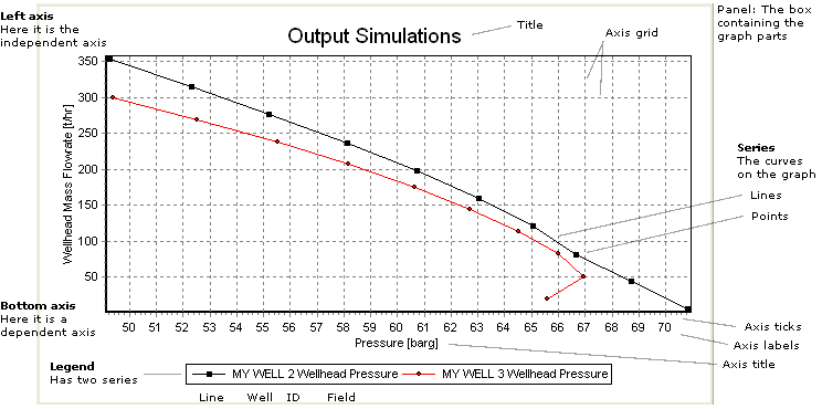
The curves on the graph are called series. This graph has two series, one black and one red.
The legend shows that:
The first series is black; is for MY WELL, is for the the output simulation with ID=2 and shows Wellhead Pressure.
The second series is red; is for MY WELL, is for the the output simulation with ID=3 and shows Wellhead Pressure.
In addition to looking at the graph, you can print it or export it in many formats, for example as a graphic, as numbers, as XML or as a text file.
| To do this with a graph ... | use |
|---|---|
| Print a graph | The Print button [Multiple Graph only] |
| The Editor window/Print tab for quick and easy printing | |
| Export a graph as a graphic (picture) file | The Editor window/Export tab/Picture tab |
| Export a graph as data (numbers) | The Editor window/Export tab/Native tab or /Data tab |
The Export button [Multiple Graph only] This works in a similar way to the standard Export function |
| To change ... | make changes in |
|---|---|
| The axis names and orientation | The Settings window |
| The series being displayed on the graph | The Series, Editor or Settings windows read more |
| The series (colours, point symbols, line types) | The Schema window for long-term changes |
| The Editor window/Series tab, to override the Schema window settings | |
| What is displayed on a geological column graph | See this tutorial |
| Zoom, scroll and change units | See here |
| The axes (title, labels, ticks, grid, position) | The Editor window/Chart tab/Axis tab and /General tab |
| The title | The Editor window/Chart tab/Titles tab |
| The Settings window to change the words of the title | |
| The legend | The Editor window/Chart tab/Legend tab |
| The Legend window [Multiple Graph only] to change the legend's format and a few other settings | |
| The panel | The Editor window/Chart tab/Panel tab |
| Paging (split a graph into several pages, for example for printing) | The Editor window/Chart tab/Paging tab |
| 3D Graphs (showing each series as a 3D ribbon) | The Editor window/Chart tab/3D tab and /Walls tab |
When you change how a graph looks, the changes are stored in the preferences file graphstyles.mdb read more.
Open the settings window to set up the axes and series on a graph:
QuickGraph or Graphical Results: click the Graph menu, then click Graph Settings.
Multiple Graph: click the Settings button.
To select the series to display, you could also use the Series window [Multiple Graph only] or the Editor window.
Normally, there is a separate series for each well name and ID. However, in Multiple Graph you can change this grouping.
When you first start using the program, it uses built-in default graph styles. As you display graphs and change the styles these become the new default. Defaults are generally saved by node and, for Settings, by the kind of Multiple Graph. Default graph styles include:
For Settings, Schema, Time Calcs and Legend: All settings.
For Order: Worksheet column order and widths.
For Import & Export: Column settings and file path.
To start, select a typical discharge simulation and click QuickGraph. Ignore the graph for now. Click Graph, then Settings to open the Settings window:
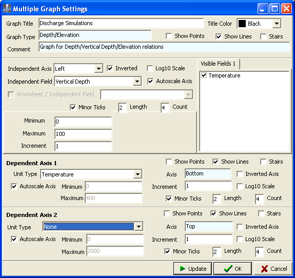
Change the settings to look like the window above:
Independent axis: Select Vertical Depth (a field in the discharge simulation) from the dropdown list; select Left to have this axis on the left; tick Invert to have zero depth at the top of the axis; tick Autoscale Axis to let the Graph module handle the axis numbers.
Dependent axis 1: Select Temperature (a unit type in the discharge simulation) from the dropdown list; tick Autoscale Axis again.
Dependent axis 2: Select None from the dropdown list.
At the top of the window, tick Show Lines and untick Show Points (there are usually many points, and displaying them will clutter the graph).
Visible Fields 1: Ensure Temperature is ticked.
Click OK:
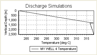
Open the Settings window and change:
At the top of the window, tick Show Points to display the points.
Click OK: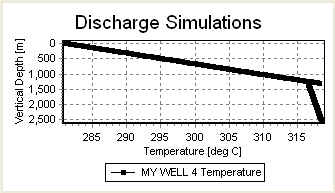
There are many points on the series, which overlap and make the line fat. Open the Settings window again and untick Show Points.
Open the Settings window and change:
Dependent axis 2: Select Enthalpy (a unit type in the discharge simulation); tick Autoscale Axis: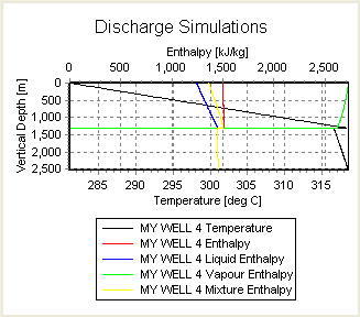
The graph has four curves for Enthalpy. This is because you selected a unit type of Enthalpy for the second dependent axis, and the discharge simulation has four fields with a unit type of Enthalpy.
Open the Settings window and change:
Visible Fields 1: Untick Liquid Enthalpy, Vapour Enthalpy and Mixture Enthalpy.
Click OK: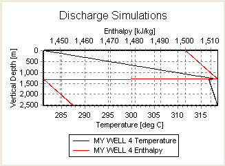
The above graph has the Enthalpy and Temperature axes autoscaled, which makes a busy-looking graph. To manually scale the axes, open the Settings window and change:
Dependent axis 1: Untick Autoscale Axis. Set Minimum to 0 and Maximum to 400. These numbers are Temperatures [degC], because Dependent axis 1 is Temperature.
Dependent axis 2: Untick Autoscale Axis. Set Minimum to 0 and Maximum to 2000. These numbers are Enthalpies [kJ/kg], because Dependent axis 1 is Enthalpy.
Click OK: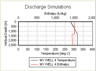
In the graph above:
the independent axis was vertical depth
the dependent axes were temperature and enthalpy.
This is how we usually think of the data, because:
vertical depth is an independent variable
and in the discharge simulation each temperature and enthalpy is calculated for a particular depth.
However, in the graph module, any field can be the independent axis, and any data types can be the dependent axes. In this example, you will display a graph of temperature against enthalpy:
Open the Settings window and change:
Independent axis: Select Enthalpy; Untick Invert to have zero enthalpy at the bottom of the axis; tick Autoscale Axis.
Dependent axis 1: Select Temperature; tick Autoscale Axis.
Dependent axis 2: Select None
Click OK: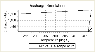
Increment is the change in value between numbers along a graph axis. For Increment = 20:
For Increment = 10:
For small values of Increment, there are too many numbers to fit along an axis, and GeoData Manager just leaves some out. For Increment = 1:
You can also set Increment to zero, and we recommend this:
For a log axis, Increment works differently, see below.
To change an axis to Log 10, tick the box in settings. A log 10 axis is green:
In the Settings menu, the word Increment changes to # per decade:
# per decade for Depth is 2.To move up and down the column, turn the scroll wheel on the mouse.
Open the settings window to set up the geological column graph:
QuickGraph or Graphical Results: click the Graph menu, then click Graph Settings.
Multiple Graph: click the Settings button.
The top half of the settings window is the same as for a line graph described here. Here we use the bottom half of the settings window. Start with these settings:
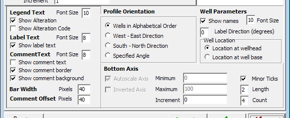
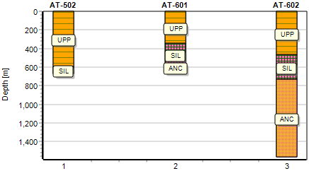
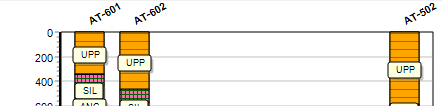
In Geology > Stratigraphy, tag three wells: AT-502, AT-601 and AT-602 (the one with Geology data ID = FORMATION). On the map view they are approximately in a line:
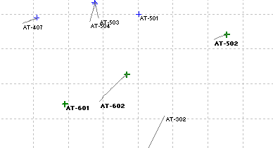
The profile orientation is Wells in alphabetical order. The graph looks like this, with the wells equally spaced across the graph. This is not a cross section yet:
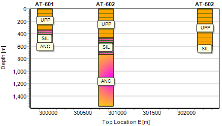
Now open the settings window, click Profile Orientation > West - East direction This places the wells on a west - east cross section through the wells:
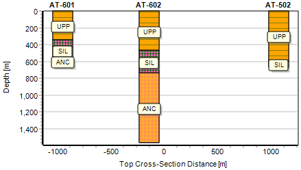
The wells are in an approximate line at about 30 degrees to the horizontal, so to display a better cross section, click Profile Orientation > Specified angle and enter 30 degrees for the angle:
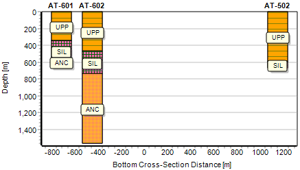
The above graphs were spaced across the graph according to the wellhead position. To space them according to the well bottoms, click Location at well base:
If the column graphs are too close together, change the label direction: this is for 30 degrees:
Note:
Labels are the abbreviations within the columns.
Comments are to the right of the columns. You will only see comments if they have been entered into the data set's Strata comment field.
If there are many types of rock the labels and comments overlap. To reduce this, choose a smaller font size in the settings or zoom in: hold down the mouse, drag it down and to the right, release the mouse.
Go to Lookups > Geology > Rock Types (read about lookups here. Right-click the rock type to change and click Edit:
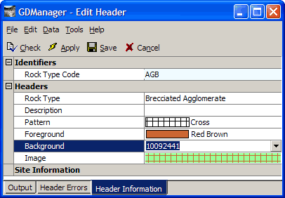
Click the field to the right of Image:
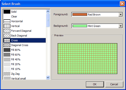
Change the pattern, foreground colour and background colour as required. Click OK, then click Save.
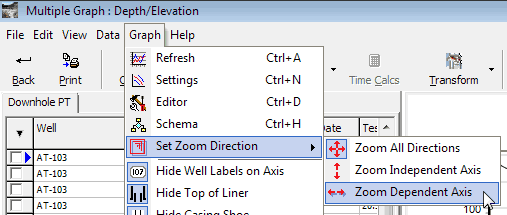
There are three ways to zoom: zoom all directions, zoom dependent axis or zoom independent axis. To set the zoom:
In Multiple Graph, click the Graph; or for Quick Graph, in the home window click the Quick Graph.
Click Set zoom direction and click an option in the flyout menu:
To zoom, move the cursor on the graph to the top, left of where you want to see, hold down the left mouse button and drag to the bottom, right of where you want to see; release the button. The shape of the cursor changes to show what will zoom.
Zoom all directions
This is the normal zoom, for example to inspect a part of a series in detail. The cursor is a horizontal and vertical arrow. To zoom, move the cursor to the top, left of where you want to see, hold down the left mouse button and drag to the bottom, right of where you want to see:
Release the mouse. Both axes zoom:
Returning to normal
Hold the left mouse button down on the graph and drag anywhere up and to the left:
Release the button:
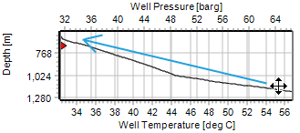
Zoom independent axis
This zooms the independent axis but not the dependent axis. The cursor is an arrow in the direction of the independent axis. In this example, depth is the independent axis; depth is the vertical axis so the cursor is a vertical arrow. When you zoom, it zooms depth but not the horizontal axis:


To return to normal: Hold the left mouse button down on the graph, drag anywhere up and to the left, release.
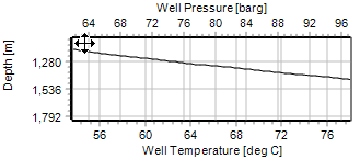
Zoom dependent axis
This zooms the dependent axis but not the independent axis. The cursor is an arrow in the direction of the dependent axis. In this example, well pressure and temperature are is the dependent axis; these are horizontal so the cursor is a horizontal arrow. When you zoom, it zooms the horizontal but not the depth axis:
To return to normal: Hold the left mouse button down on the graph, drag anywhere up and to the left, release.
Scrolling moves all series (and axes) in any direction, so that you can see another part of a graph; usually a zoomed graph, as here. Hover the cursor over the graph. Hold the right mouse button down and drag the graph within its axes. Release the button.
To return to normal: Hold the left mouse button down on the graph, drag anywhere up and to the left, release.
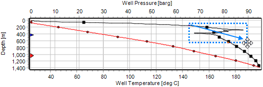
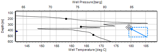
Dragging an axis moves that axis and any of its series, so that you can see another part of a graph; usually a zoomed graph, as here. Hover the cursor over the graph axis; the cursor changes to a  . Hold the left mouse button down and drag the axis. Release the button.
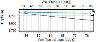
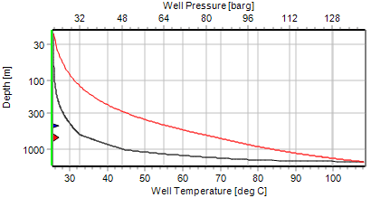
Here, we dragged the well pressure axis to the left so we could see the well pressure and well temperature series together.
To return to normal: Hold the left mouse button down on the graph, drag anywhere up and to the left, release.
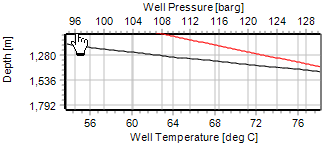
Right click the axis to change, click a new unit:
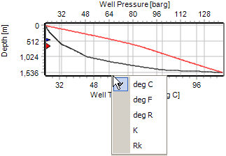
Note that when you change units like this, the axis always changes to Autoscale, because because the original Minimum and Maximum might not be appropriate for the new unit.
When you move the mouse over an item in a graph legend, the corresponding series (line) is highlit. For example:
You can make all the changes listed here above to a Quick Graph or Multiple graph; for the graph you see when editing a data set, you can only zoom all directions and change axis units on the fly.
Zooming works slightly differently for a geology column graph:
zoom independent axis for obvious reasons.zoom independent axis if you start the zoom in the column graph, and zoom all directions if you start the zoom in the line graph.To customise how the graph zooms and scrolls, open the Editor window/Chart tab/General tab.
Use the schema window to set up series and point colour and style read more. To open the schema window:
QuickGraph: click the Graph menu, then click Graph Schema.
Multiple Graph: click the Settings button.
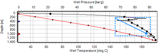
Select any two downhole PT tests from two different wells. Click the  beside
 Multiple Graph and click Depth/Elevation Graph to open Multiple Graph.
Click Schema and set the Schema rules tab data as shown above. Click OK.
If necessary, use Legends to change the legend,
and use Settings to turn Points on, select Well Temperature and Well Pressure as the visible fields and to set the graph axes until your graph looks like this:
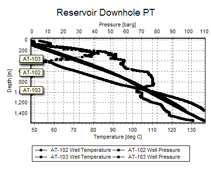
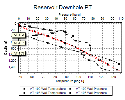
The above graph is confusing, because it has too many points, and the lines and points are all the same colour. Click Schema and use the Schema rules tab to make the graph look better:
To reduce the number of points, click Display a maximum of and enter 10 into data points in each series.
In Settings above you saw there were two visible fields, Well Temperature and Well Pressure. In the schema rules Line colour dropdown list, choose Cycle line colour by field name. This uses a different line colour for each field, so the two Temperature lines are now a different colour to the two Pressure lines. Click OK to see this:
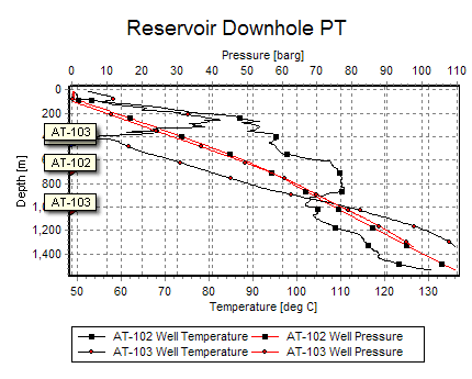
Click Schema again. There are two data sets, one for each well. In the Symbol dropdown list, choose Cycle symbol by data set and in the Symbol colour dropdown list choose Cycle symbol colour by data set. This makes the points for each data set (well) different. Click OK. The graph is now less confusing:
There is no correct schema for a graph, just schemas that help you interpret the graph better. Try these options for schema rules one at a time and see what works for you:
To change the line colours to other than black, then red, use schema's Colour Order tab. Change the top two Pen IDs.
Set Offet between Line Colour and Symbol Colour nonzero to further distinguish between the two data sets.
Reverse the options: cycle line colour by data set and cycle symbol and symbol colour by field name.
But probably the best thing here is to use the settings window, turn off autoscale axis for both dependent axis 1 and 2 and set the axis minimums and maximums to move the temperature and pressure series apart on the graph. You learnt how to do that above, right?
Usually you will select one or more data sets to graph before you click Graph. However, you can click Multiple Graph without selecting any data sets first, then:
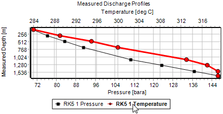
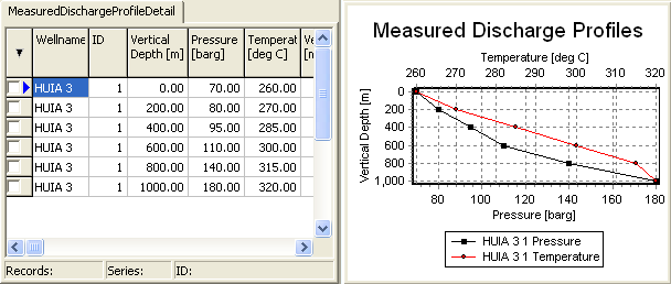
This example is for a measured discharge profile:
In the main program go to the type of data set that you want to graph, measured discharge profile.
Click Multiple Graph.
The graph module starts and the worksheet shows an empty data set for a measured discharge profile:
![]()
Enter data for the first vertical depth: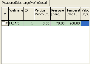
Click  (top left corner of worksheet) and click
 Save changes to accept your data for the first depth:
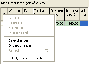
Click again and click Add record to create a new empty row in the worksheet.
Repeat the above three steps to enter a row of data, save it and add a new record until you have entered all your data:
Click Settings and check these settings:
Independent axis is set to Vertical Depth, Inverted, Left, Autoscale Axis.
Dependent axis 1 is set to Pressure, Autoscale Axis.
Dependent axis 2 is set to Temperature, Autoscale Axis.
At the top of the window: The setting is Show Lines, not Show Points.
Visible Fields 1 is set to Pressure and Temperature.
Click OK:
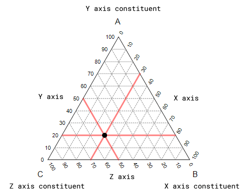
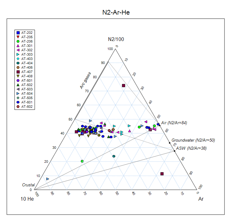
A ternary graph has threes axes, X, Y and Z, arranged in an equilateral triangle. In GeoData Manager, Chemistry > Fluids - by Sample Set and Chemistry > Fluids - by Sample can display ternary graphs for any three constituents. Each point on the graph shows the relative proportions of each constituent, as a percent.
The graph below displays:
The total ppm is 200, so the point on the graph shows A is 20%, B is 30 % and C is 50%.
A ternary graph is a type of multiple graph, with the same worksheet and graph windows. Use the same multiple graph tools; the settings window is specific to ternary graphs.
GeoData Manager has three built-in, commonly used, graphs, Na-Mg-K (Giggenbach), Cl-HCO3-SO4 and N2-Ar-He. The N2-Ar-He graph can display lines and labels. For example, to display an N2-Ar-He graph:
Navigate to Chemistry > Fluids - by Sample Set.
Create a Header View with the following fields: Sample Site, Sample Type, Sample Set, Sample Time / ID, Depth sampled, Gas N2, Gas Ar, Gas He.
Save this Header View as “N2-Ar-He” for future reference and then press OK.
Tag the data to plot. It is a good idea to tag only that data with values greater than zero (remember negative values are used to express the accuracy of the data, and are not real values).
In the tool bar at the top, click the down arrow beside the multiple graph tool and click N2-Ar-He.
The ternary selection window opens. Since this is a built-in graph you can not change the constituents here. Note how GeoData Manager will automatically divide the N2 value by 100 and multiply the He value by 10 when it displays the graph.
Click on Draw and Save Graph in the Ternary Selection form.
Note
The graph labels can be turned off in Settings.
If the points here are close together, zoom in in the usual way by dragging over an area of the graph from top left to bottom right.
If a constituent name or axis label are in the way you can drag these, though GeoData Manager does not remember them.
In the settings menu, try different grid lines and try displaying graph points or lines.
GeoData Manager lets you choose the constituents for a ternary graph.
Go to Chemistry > Fluids - by Sample Set. Tag some records.
In the tool bar at the top, click the down arrow beside the multiple graph tool and click General ternary graph.
The ternary selection window opens. For each axis, select the constituent from the dropdown list and, if required, enter a factor to multiply or divide each value by and choose to square or square-root each value before graphing it. Specify ppm or molar units. This is what I used:
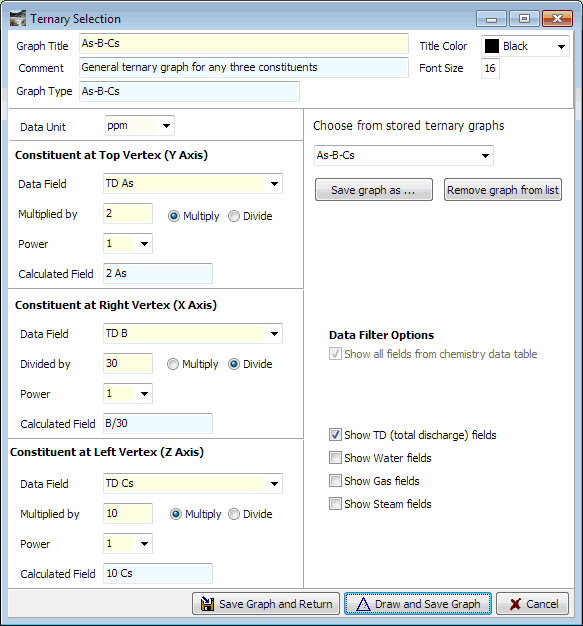
Note how GeoData Manager has automatically generated a name for the graph As-B-Cs.
Click Draw and Save Graph to save the graph under this name and draw the graph:
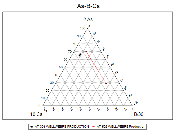
Here the points are clustered near the top of the graph. To see a better spread:
Ternary at the top left to return to the ternary selection window, where you can change the factors to multiply or divide the values by.Zoom to top vertex: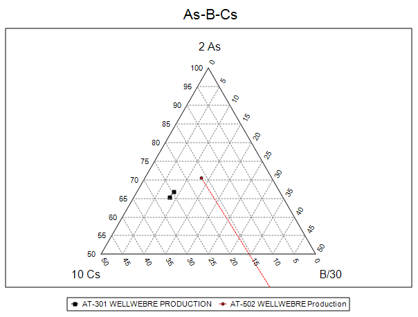
Work with saved ternary graphs in the ternary selection window. To open this window:
General ternary graphTernary at the top left.GeoData Manager saves your general ternary graphs in the dropdown list under Choose from stored ternary graphs. When you enter constituents for a new general graph, GeoData Manager automatically generates a name for the new graph in the dropdown list, using the constituents, for example:
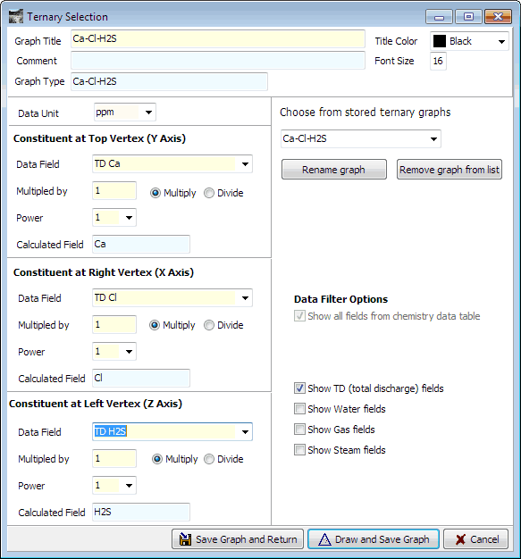
To enter a better name, click Rename graph and enter the new name.
GeoData Manager saves your graph's constituents and settings when you click Save graph and return or Draw and save graph.
Later, in the ternary selection window you can reload a graph's constituents and settings by selecting the graph in the dropdown list of stored graphs. After you have done this you can:
Draw and save graph.Save graph as to change the stored graph's name.Remove graph from list to delete the stored graph.